Building the User Interface
UI Design is a good start to building an application as it helps you define the scope of your application. ZK provides hundreds of readily made UI components so developers can rapidly build their desired user interface by combining and mix matching these components without having to create them from scratch.
In ZK, you can use ZK User Interface Markup Language (ZUML) 1, an XML-formatted language, to describe UI. By ZK's convention, the files to describe user interface with ZUML uses .zul as the name suffix. In zul files, one component can be represented as an XML element (tag) and you can configure each component's style, behavior, and function by setting XML element's attributes.2
In the case of this example application, first of all, we want to design a window with the specified title and normal border as our application's frame.
Extracted from search.zul
    <window title="Search" width="600px" border="normal">
        <!-- put child components inside a tag's body -->
    </window>
As window is the outermost component, it is called the root component. Window is a commonly used container because it is a basic display element of a desktop-like application while it can also enclose other components. All other components inside window are called its child components and should be put in window tag's body. We set window's title bar text with "title" attribute and make window display a normal border with "border" attribute. For "width" attribute, use CSS like syntax such as "800px" or "60%".
Basically, our example application's user interface is divided into 3 areas within the window, they are (from top to bottom) search function, car list, and car details.
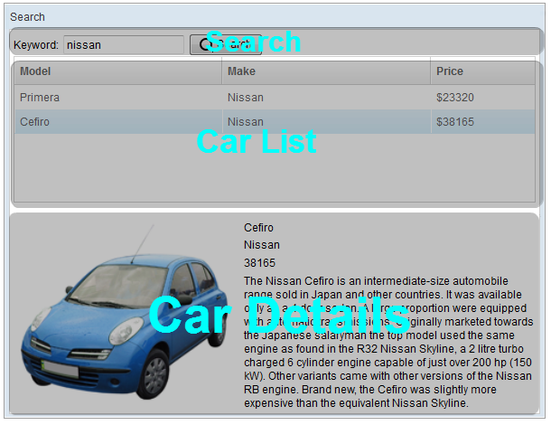
Search Area: ZK components are like building blocks, you can combine and mix-match existing components to construct your desired UI. To allow users to search, we need a text to prompt users for input, a place to enter keywords, and a button for triggering the search. We can use the following ZK components to fulfill this requirement:
Extracted from search.zul
        <hbox align="center">
            Keyword:
            <textbox id="keywordBox" />
            <button id="searchButton" label="Search" image="/img/search.png" />
        </hbox>
hbox is a layout component that arranges its child components
horizontally and you can probably guess by now that the h represents
horizontal. As these child components have different heights, we set
the "align" attribute to "center" so they are aligned neatly along their
center line. Here we also specify an "id" attribute for some components
which allow you to control them by referencing their id. You can also
easily create an image button by specifying the path for the "image"
attribute.
Car List Area. ZK provides several components to display a collection of data such as listbox, grid, and tree. In this example, we have chosen to use a listbox to display a list of cars with 3 columns: Model, Make, and Price. We set the "height" attribute, so the number of rows visible is limited with respect to the height specified; you can drag scroll-bar to see the rest of rows. The "emptyMessage" attribute is used to show a message when listbox contains no items. The listbox is a container component, and you can add listhead to define a column. The listitem is used to display data, and the number of listcell in one listitem should equal to the number of listheader. Here we use listcell with static label to demonstrate structure of a listitem, and we'll talk about how to create listitem dynamically with respect to each data object in the next chapter.
Extracted from search.zul
        <listbox id="carListbox" height="160px" emptyMessage="No car found in the result">
            <listhead>
                <listheader label="Model" />
                <listheader label="Make" />
                <listheader label="Price" width="20%"/>
            </listhead>
            <listitem>
                <listcell label="car model"></listcell>
                <listcell label="make"></listcell>
                <listcell>$<label value="price" /></listcell>
            </listitem>
        </listbox>
Car Details Area. Like the hbox, vbox is also a layout component which arranges its child component in vertical order. By combing these 2 layout components, we can present more information on a screen. The "style" attribute allows you to customize component's style with CSS syntax.
Extracted from search.zul
        <hbox style="margin-top:20px">
            <image id="previewImage" width="250px" />
            <vbox>
                <label id="modelLabel" />
                <label id="makeLabel" />
                <label id="priceLabel" />
                <label id="descriptionLabel"/>
            </vbox>
        </hbox>
You can see the complete zul file through the link in the References section. 3
1. ZUML Reference ↩
2. ZK Component Reference ↩
3. search.zul ↩